It is said that as much as two thirds of the processing capacity of the human brain is devoted to visual processing and, while this is hard to verify, it is an everyday truth that we all find pictures much easier to understand that words or numbers. In scientific work our ‘picture’ is a graph. Just think how often your first action on receiving a spreadsheet full of numbers is to click on ‘graph’ in order to get a first impression of what information might exist within the numbers.
The everyday graph is a simple plot of x versus y and its time trend variation which is y versus t. We can add a third and perhaps a fourth variable to an x-y graph by plotting contours and perhaps adding colour. We can overlay perhaps four or five traces on a y-t graph without losing legibility. There are specialist graphs such as steam charts and phase equilibrium diagrams ingeniously showing four or five variables but requiring too much effort to be used as everyday graphs.
The chart containing the most variables is the graphic representation of Napoleons Moscow Campaign of 1812 drawn by Joseph Minard in 1861. It contains seven variables.
So the practical graph for everyday use has had a limit of 2-3 variables. The consequence of this is that we have all grown up with the unconscious habit of dividing problems into units of 2-3 variables and plotting many graphs (but never enough to show all the combinations). Sometimes one sees engineers with many x-y or y-t graphs on the same page struggling to understand the total behaviour of a complex process, for instance, process identification.
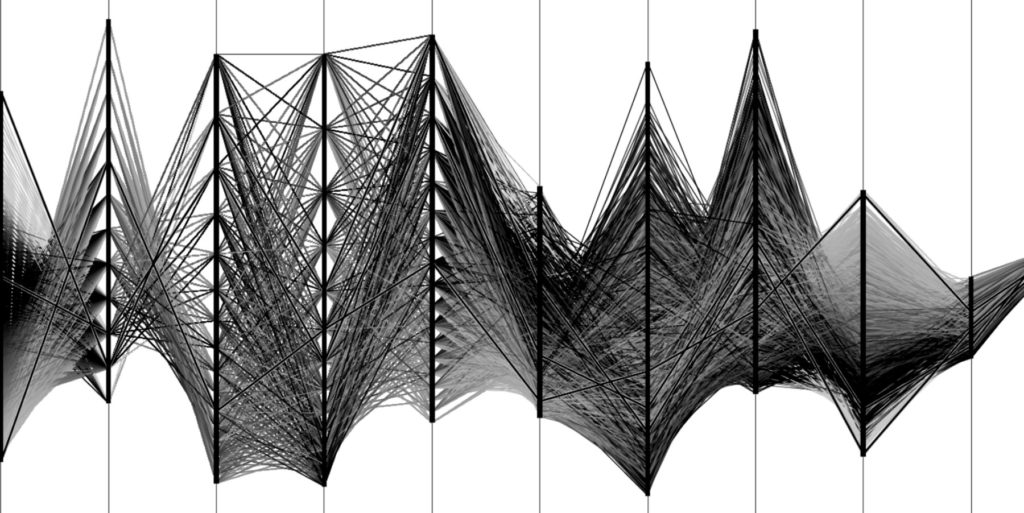
C Visual Explorer (CVE) brings this to an end. The parallel coordinate graph invented by Inselberg in the 1970s and made practical by the advent of cheap PCs in the 1990s allows as many variables as one needs. We have used CVE with 220 variable graphs and others have reported use with over 500. The association between all the variables is preserved hence we don’t need to divide the problem into 2-3 variable units and don’t need to resort to statistics to re-associate all the 2-3 variable units. And the graph is in terms of only the original and known variables so it is not limited to those with an advanced mathematical education but is usable and meaningful to everyone.
But remember, you were probably introduced to x-y graphs in nursery school and it has taken you all your life to get as good as you are today at applying them to your problems in a meaningful and useful way.
CVE graphs have a learning curve too. It is not steep but you will get better and better at extracting information from CVE graphs as you use them more and more. They will encourage you to be an even better engineer or scientist but you still have to work to get the answers. What you will find right from the start is that you will perform much more analysis in the same time and gain far more insight into your process by having to explain the many new facts that will become apparent in the CVE representation.
For instance, as soon as you apply any kind of ‘good operation’ criteria, you will see ‘Black Holes’ for the first time and will be challenged to explain in process terms why they are where they are and how best to operate to avoid them. If you apply several levels of ‘good operation’ as separate queries in different colours you will obtain a multi-dimensional ‘contour’ map which will show you by variable where top grade product slowly changes to second grade, or where you suddenly fall off the edge straight into bad product. If product quality isn’t an appropriate criterion then use the best 20% of yield or throughput or fuel usage compared to the second-best 20%. It is worth looking at how the worst 20% was achieved too as valuable ‘don’t do this’ lessons can be learnt. You will probably find that the best yield and the best throughput don’t coincide and you’ll have a trade-off decision to make about how to compromise between them.
There are probably several final product quality criteria that have to be met. Put these specifications as ranges into a query and see how much of your production meets all the specifications. You’ll actually be looking for the first time at the one-page production report that your production manager has always wanted but which was impossible before the CVE graph. You’ll also be able to see how sensible your specifications are compared to the manufacturing ability of your process and this may give you scope for eliminating some tests of for tightening some specifications. For those whose specifications are set by an external body, you will be able to see ‘give-away’. When there are multiple specifications to be met there is always some giveaway and with CVE you can see when this occurs and how to reduce it.